In January I decided that it was time to fix UI shortcuts that I took during initial development of Time’s UI. I hid critical actions behind unclear gestures and had entire trees of alerts. This was a strategic decision to build the core faster, but it was time to take the next step.
I started by replacing the “edit entry” page. This standalone, single-entry page deep within the application served as an excellent test for the ability to make my core platform function with SwiftUI and as a focused place to explore. After successful results, I expanded my SwiftUI tests into a top-to-bottom rewrite of the UIKit UI layer with the following problems to solve:
- Complicated section organization on the home page
- Difficult to maintain and fragile category list code
- Alert driven edit interfaces for categories, entries and accounts
- Project maintainability: I need to be able to set this code aside for a season
My redesign was very successful. All of the specific problems were fully resolved. SwiftUI’s limitations and requirements drove me to a stronger end result from both an engineering and a design perspective.
SwiftUI as a Design Tool
SwiftUI is missing many UIKit features such as swipe gestures, destructive menu items, and text field alerts. These common patterns are not available without additional work that would take away from the elegance SwiftUI offers.
I set the requirement to work fully within the supported sandbox. This limitation put a large number of design restrictions on what and how I could build the interface, and ultimately the limitations of SwiftUI are why this redesign was a success.
SwiftUI jumps out as an extremely powerful tool to prototype and iterate quickly when working within its limitations. This required me to rethink all interface patterns, and really explore how users could interact with my application.
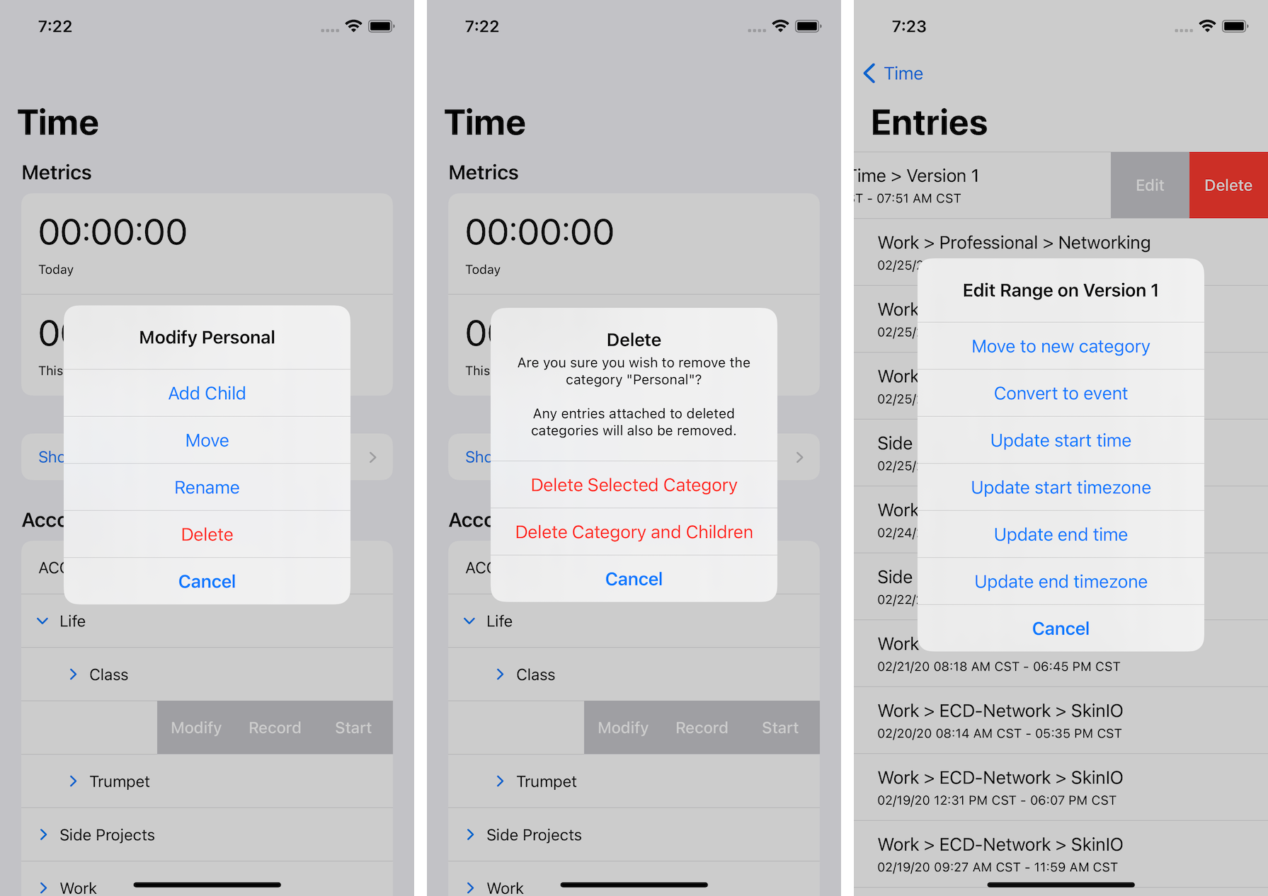
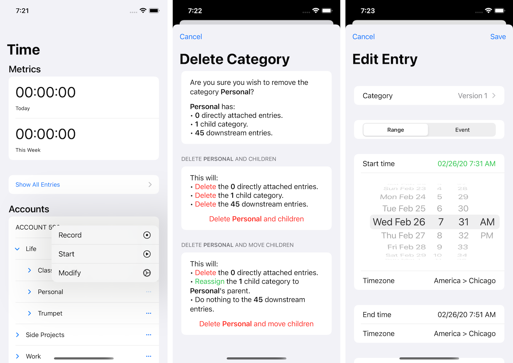
Without the lack of swipe gestures, I probably would not have explored adding a menu button to every category. This addition and the easy to navigate menu within it is the biggest felt improvement from the refresh. The inability to add text fields within alerts forced a careful evaluation of every text-based action and the information I shared in presented sheets. The lack of destructive menu items forced pages where I could indicate what and how a destructive action would work.
The limitations of SwiftUI forced careful evaluation that took me from:

to this refreshed UI:

The animations are smoother, the actions are clearer, and the entire project is much more pleasant to use. By bending to what SwiftUI allowed, I’ve created an application that is better than what I started with.
SwiftUI as an Engineering Tool
Heavy code changes were required to support SwiftUI. I had to add Combine support to my models and carefully re-evaluate where data was owned and stored. As with the design language, the effort of supporting SwiftUI (and supporting it well), forced strong engineering changes.
The original application was built with a central table view supporting all categories, metrics, recent categories and a number of other support items through sections. Animating the expand/collapse of categories required careful tracking and calculation of where to animate rows in and out. It worked, but it was a lot to maintain and it wasn’t code that could be easily rewritten without impact.
With SwiftUI my home screen code went from complicated calculations to:
NavigationView {
  List {
    MetricSection(...)

    if hasRecents {
      RecentSection()
    }

    ForEach(accountTrees) { (tree) in
      CategoryList(root: tree, ...)
    }

    ...
  }
}
This code is easy to read and easy to modify. It’s also code that I can let sit for years and come back to easily.
The recursive code I had previously written to calculate children list items and where/how to show categories could be dropped right in to this new system. I no longer had to run some calculation and then say “draw 5 rows.” I could instead have my views constructed through a recursive ViewBuilder that would build exactly what was needed.
The merging of my engine code and the UI logic is what makes this so much easier to reason about, and so much easier to maintain. Animations and more come as a side effect of modeling the data correctly and just using it to build views.
It’s incredible when it all comes together, and I’m thrilled with the final result.
Conclusions
I am very happy with how this redesign went. SwiftUI is not the tool for every project (or most), but when you work within its limitations and have an application that aligns with those limitations, it’s an incredible asset.
Xcode’s performance compiling SwiftUI code and worthless error messages made it a pretty frustrating process. This code was not fun to write, and the constant compilation took away from much of the joy and speed that I normally find in personal projects. Correct code compiles (as it should), but single missed characters or mismatched types result in limited to no help from the tooling. SwiftUI compilation errors remind me of errors in Javascript (for all the bad reasons).
SwiftUI helped me develop better UX and shaped my core engine into a more robust and easier to maintain project. This was absolutely worth the effort, and the end result is a great foundation for the future. It wasn’t until the very end of the effort that I even knew if I’d keep any of the new work and I’m so excited that I can.
This post is the fourth in a series about my Time project.