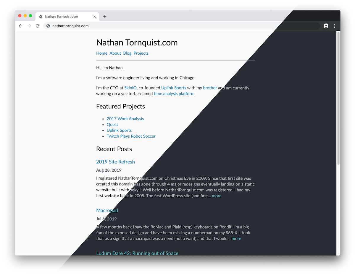
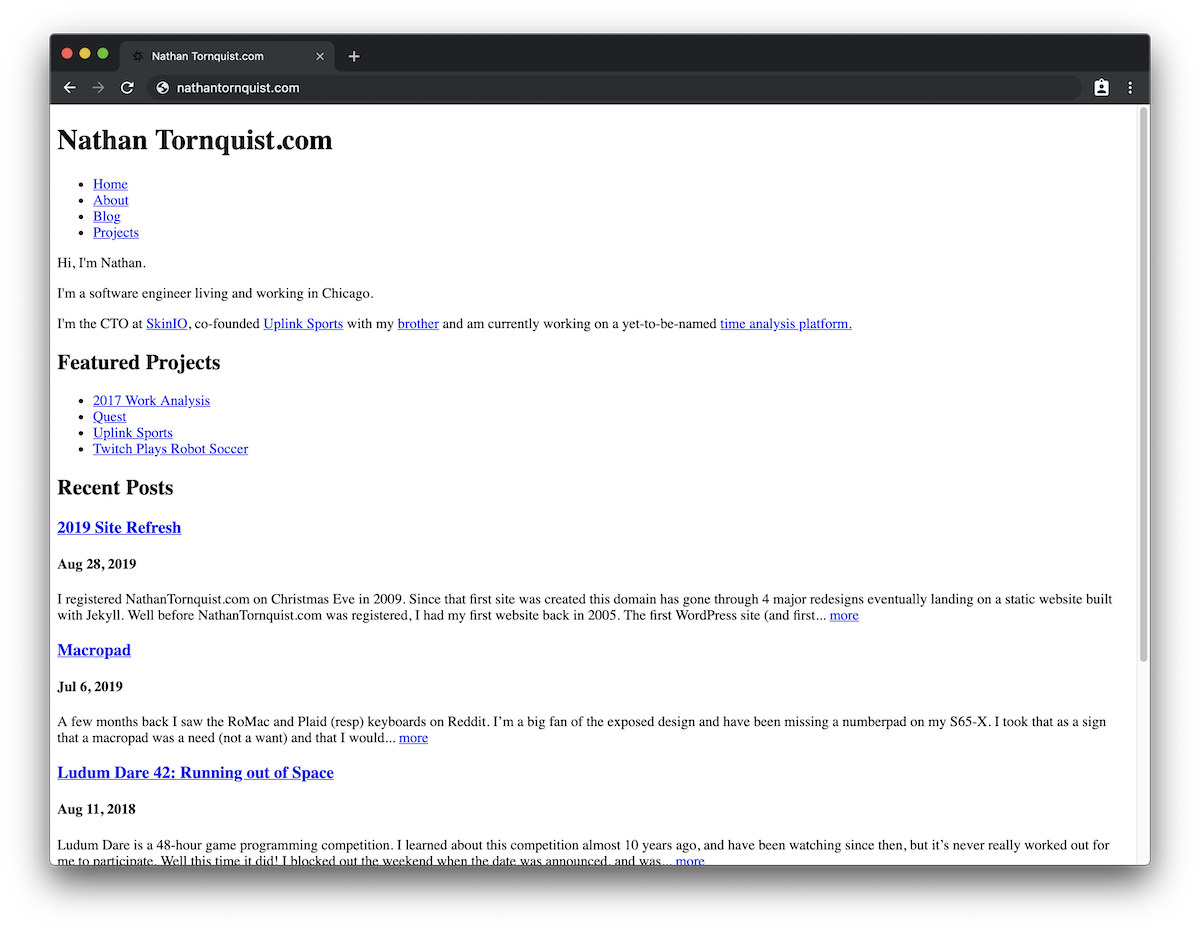
I registered NathanTornquist.com on Christmas Eve in 2009. Since that first site was created, this domain has gone through 4 major redesigns eventually landing on a static website built with Jekyll.
Well before NathanTornquist.com was registered, I had my first website back in 2005.
The first WordPress site (and first public site) came with a more formal blog and project pages. At the time, Arcade Classics was the most recent project and the history included websites I had built for some local community organizations.

As I began Android development, I switched to a project-forward design:

And finally landed with the Jekyll site.

Since 2015, I’ve tweaked the home page, but for the most part the structure was fairly consistent.

In my most recent redesign in August of 2015, I migrated all my old posts and content into markdown files and created something a bit cleaner than WordPress. I was (and still am) very happy to have full version control on every aspect of the site.
However, that Jekyll transition included some modified and forced themes. I was using Bootstrap for the grid system, and had another theme running on top. There was a lot of code and I had not written or even read most of it.
In this redesign I set out with a few goals.
- Use HTML5 semantic elements
- Dynamically support light and dark mode
- Remove heavy gallery plugins
- Manage/own all styles
- Remove JS completely
Use HTML5 Semantic Elements
By using Bootstrap, I had a site layout that was very div and class heavy.
The site adjusted well, but it was very heavy. The core layout was:
<html>
  ...
  <body>
    <section class="...">
      <div class="container">
        <div class="row">
          <div class="col-...">
            ...
          </div>
        </div>
        ...
      </div>
    </section>
    ...
  </body>
  ...
</html>
If you look, there are a minimum of 3 layers from the section to the actual content in that section. Those layers all control the grouping and alignment of elements. I wanted to completely remove that, and instead use the new HTML5 elements that described the intent of the content.
These elements include section, article, summary and more. By using these
elements carefully, I was convinced that I could use a very small set of styles
to organize and manage the entire website. Good structure would mean that I
would not need a large number of classes or ids.
Dynamically support light and dark mode
After reducing the number of styles and elements in the site, I was hoping that it would be easy to support light and dark mode. In the end, it was even easier than I expected. I used CSS variables and all of my light/dark mode behavior is managed with a simple media query:
/* Colors */
:root {
  --color-background: hsl(230, 1%, 98%);

  --color-mono-0: black;
  --color-mono-1: hsl(230, 8%, 24%);
  --color-mono-2: hsl(230, 6%, 44%);
  --color-mono-3: hsl(230, 4%, 64%);

  --color-cyan: hsl(198, 99%, 37%);
  /* ... */
}
@media (prefers-color-scheme: dark) {
  :root {
    --color-background: hsl(220, 13%, 18%);

    --color-mono-0: white;
    --color-mono-1: hsl(220, 14%, 71%);
    --color-mono-2: hsl(220, 9%, 55%);
    --color-mono-3: hsl(220, 10%, 40%);

    --color-cyan: hsl(187, 47%, 55%);
    /* ... */
  }
}
I have not provided any switches for the user to manually toggle light/dark mode and instead the site will respond to the local preferences that their browser shares.
Remove heavy gallery plugins
When I moved the blog to Jekyll, I started using Photoset Grid with
Colorbox. Together these tools gave me the ability to include a list of
images and control the layout using { layout: "N..." }.
ex:
{ layout: "312" }would give three rows of pictures with three images in the first row, one in the second, and two in the third.
While these galleries looked nice, and I really like the features they provided, the plugins were heavy. They would listen to the window change and readjust all of the image sizes. This was normally delayed and would adjust the scroll position as the content caught up.
I was not happy with the latency.
As part of the redesign, I wanted to remove any JS in the photo layout, and use flexbox instead. Browser support is widespread enough that I am not worried about many issues. Especially because the demographic that I would expect to read this blog will be on more modern hardware.
From any of my projects or blog posts I now just need to drop in the following code:
{% include photos.html
  height="58" id="<local page id>"
  img1="..."
  img2="..."
  img3="..."
%}
The included photos template only supports a single row and up to five images, but it is easy enough to use a few of these objects in a row to generate a grid with multiple rows. This also has the huge added benefit of removing the need for external post/project-specific include files. By making this switch I was able to remove an enormous number of support files.
The constructed photos object uses flexbox and will dynamically adjust based on the view width. The resizing of the images is much much faster than previously and the browser no longer needs to load all the images and wait for the JS sizing to complete before the total page height can be calculated.
Manage/own all styles
With Boostrap as the base and Agency (the theme) on top, there were about 8,000 lines of CSS that I had neither written nor read. This meant any modifications to the site were hacks at best and it was hard to really own. I was using the styles but they were not mine.
After updating all of the layout system and removing the photo gallery plugins, I had a minimal, well-structured site that I could actually style.
I started styling from the raw page.
The other benefit of well-structured HTML is that the browser can infer a lot of base styles that are actually good. I’m happy knowing that if the CSS fails, the core content of my website is still easy to navigate and consume.
In the end I have:
| Category | Lines |
|---|---|
| Dynamic Coloring | 45 |
| Structure and spacing | 87 |
| Width adjustments | 27 |
| Gallery code | 29 |
| Blog/Project lists | 11 |
| Syntax highlighting | 68 |
I’m very happy with how that came together. There is more code for the structure than I was anticipating, but it’s very straightforward and will be easy to manage day forward. The syntax styles are only loaded if code is displayed, which further reduces the amount of content for a base page load.
Remove JS completely
After all of the work for the previous goals, I had a final stretch goal of seeing if I really needed javascript at all. JS was no longer used for any styling or content. I was loading the few youtube video references in iframes and did not need any code to support that.
The only thing left was Google Analytics.
I really enjoy seeing how many visitors I get, but I had been leaning towards replacing Google Analytics with my own counter for general privacy protection already. I made the call to remove the analytics without a replacement so that I could have a clean and fully static website.
Note: JS tracking was reintroduced on 1/15/20 with Goat Counter. Goat Counter has a solid privacy policy and seemed like a fair compromise.
Conclusion and Next Steps
Regarding the original goals:
- Use HTML5 semantic elements
- Dynamically support light and dark mode
- Remove heavy gallery plugins
- Manage/own all styles
- Remove JS completely
I am very happy with how things worked out.
- The layout is more responsive than ever while also being very light and very clear.
- The semantic elements have greatly removed nesting and made it much easier to also replace and streamline all of the styles in the site.
- I no longer have any events listening to the window size and javascript has been removed from the website completely.
- The site automatically adjusts based on the user’s light/dark mode preferences.
I met all of the goals that I set out to accomplish, but also lost a few things.
Despite being heavy, the ability to click an image and view a gallery is very nice. I would like to rebuild that in dedicated pages that allow easier viewing of large pictures.
Though not a regression, the size of my images is a pretty big disconnect with the focus on speed and succinctness. I do not have any build scripts or compression being applied, and the images that I’m loading for the posts are full-size. They’re far bigger files than I need to be loading.
I am waiting to remove the large images. I would like to write a build script that scales the images down at the same time that I’m reintroducing gallery support.
I also need to go ahead and build a custom analytics solution for this site.
That’s really all though.
- Optimize images and replace gallery features
- Introduce new analytics solution
Other than that, I’m very happy with how the update came out, and I’m excited for what the cleaner codebase will empower in the future.