Manual time tracking by definition is a manual process. It requires a person to explicitly start a timer when a task begins and stop the timer when it ends. For any automatic tracking it’s important to know if a timer is running, but when requiring explicit user interaction the timer’s status becomes the most important design element in the software.
Throughout this post, I’d like to break down the interface and UX problems I was trying to solve with Time, and how I ended up with the current interface strategy. If this is your first time hearing about Time, you may want to start with the first post in the series.
What can the user do?
My data is consists of entries that are the actual tracked time, and categories that are the “time buckets” entries are assigned to.
An entry can either be a range with a start and (optional) end time, or an event with a single timestamp. A range without an end time is a running timer. A timer is running for a given category when an event without an end time exists for that category.
I’ll break down the true database organization and consistency of the data in a future post, but consider categories as an infinite filing system. You can make folders and folders within folders. When analyzing the records in each folder I wanted to make sure that you could say “give me all of the data in folder X, but exclude the data in sub-folder Y and Z.”
Consider the following actions:
$ status
> no entries -- "Work timer stopped"

$ Start work timer
> entry created with start = now

$ status
> one open entry -- "Work timer running"

$ Stop work timer
> open entry updated with end = now

$ status
> one closed entry -- "Work timer stopped"
While manipulating their data, the user can:
- Start a timer on some category
- Stop a running timer on some category
- Stop a specific running timer (ie: close an open range)
- Record a single event on some category
Starting and stopping a timer on a category is really just an alias for creating a new entry with only a start time, or setting the end time on an existing entry.
Problems to solve
The previous time tracking platform I had been using organizes the app into many top-level pages under a hamburger menu. Statistics, entries, projects and a timer view are all siblings.
Most work days ended with me stopping a timer and looking at the day’s metrics. This meant that each morning I would open the app and have to navigate back to the timer or project page to start a new timer as I began my work for the day. My desired action was always three taps away, and this quickly became a nuisance.
This app could also indicate an active timer using a notification badge, but if
you use this feature it means that you’ll have an unclearable (1) on the home
screen of your phone during all working hours.
In building a new app from the ground up I wanted to remove all frustrations, no matter how small. The purpose was to build something that I could use and rely on for years. My design goals where:
- Clearly indicate if some timer was running without opening the app
- Clearly indicate which timer was running immediately after opening the app
- Avoid notification badge noise
- Reduce navigation time within the app
Inspiration
I want my software to feel like an intentional extension of the platform that it was designed for. This means that it feels consistent. The appearance and interaction patterns need to match the OS, and any deviations or new concepts are done in such a way that they seem like a logical extension of what was already there.
I decided to base the foundation of my UI around Apple’s Health, and Reminders. They’re light and native components of the platform.
For extensions to this design pattern I’m primarily looking at Things 3. Things 3 is great inspiration for guidance on complex tree views, in-line interactions and incredible design all-around.
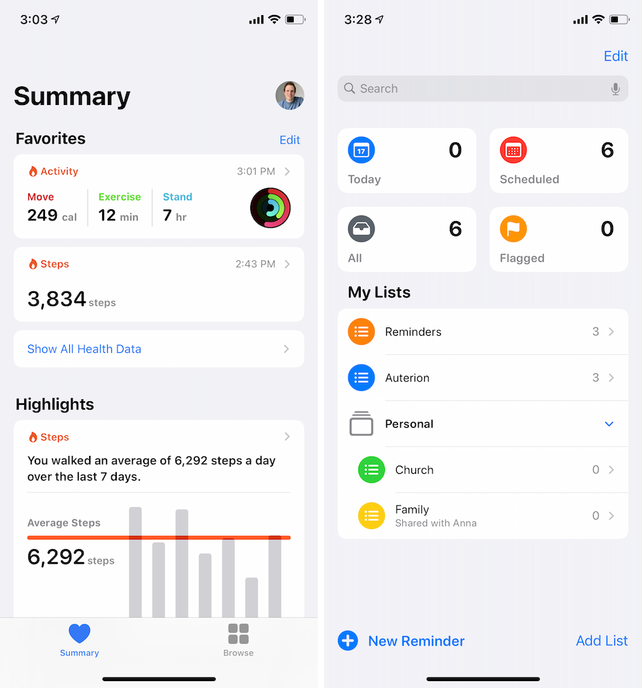
Health and Reminders bring a few critical concepts including live metrics on the landing page, a clear flow of navigation, and in-line folders.
In reminders when viewing an overdue item the date will turn from the default black to a bright red to draw your attention.
The major design concept not covered from either of these apps is front and center actions. To add health data you have to go all the way into the specific health category. To mark a reminder complete you have to go into the list and check it off.
It is really important to me that the timers are the main interaction point and that they are visible immediately without any additional actions.
Problems (and my solutions)
With clear guidance on the design language I wanted to work within I started to plug data in and move content around. During the UI development I was using the app daily and feeling all of the pain of my early prototypes.
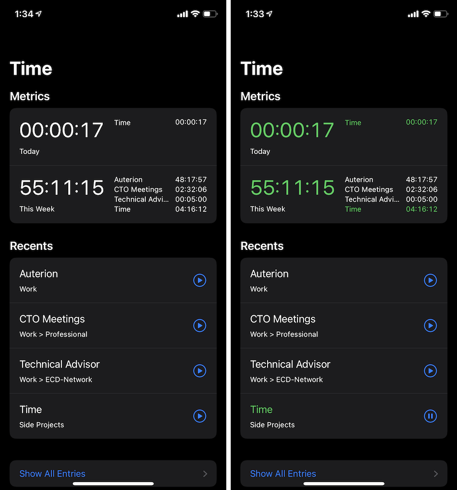
On the left you can see the UI that was built as I worked through the data layer originally, and on the right you can see the “final” UI designed to meet the most important UX items.
Clearly indicating if some timer is running without opening the app
Since iOS 10.3 Apple has allowed developers to ship alternative app icons with their apps. Many devs offer a handful of icons and offer more icons as a paid upgrade.
My original plan was to dynamically update the icon whenever an action was triggered in the app that would update the timer status. As an extension of this, the icon could be dynamically modified based on push notifications to update based on actions performed on other devices or by other people.
Unfortunately these APIs automatically show a “You have changed the icon for XXX” popup. A number of developers are using private APIs or playing with threads to try to prevent the popup from being shown. This popup is a complete show stopper though. Can you imagine starting or stopping a timer and getting an app icon popup every time? That’s a hard no-go.
I was considering other approaches when Apple announced home screen widgets. I’ll cover widgets in detail in my next post, but for the purposes of this list, this item is solved (and exceeded my expectations).
By skipping notifications badges and adding widget support, Avoid notification badge noise is also solved.
Clearly indicating which timer is running
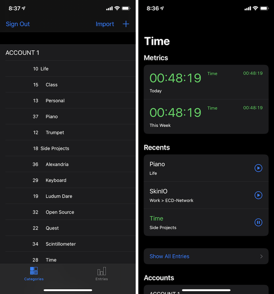
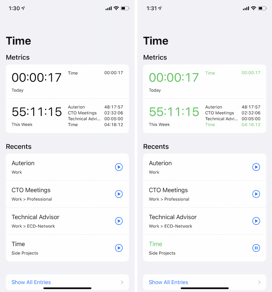
Within the app, you can see how I used the health-style UI and where everything comes together. I wanted to provide quick access to:
- Daily and weekly totals
- Custom metrics
- Recent categories
- Running categories
- All categories
- Other settings data.
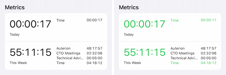
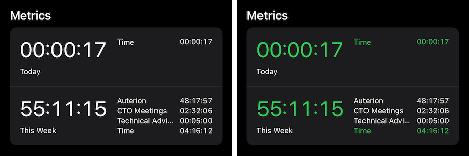
Metrics take the front and center position at the top of the screen on-launch. Green means go. This block immediately shows which timer or timers are running and beings to answer basic usage questions.
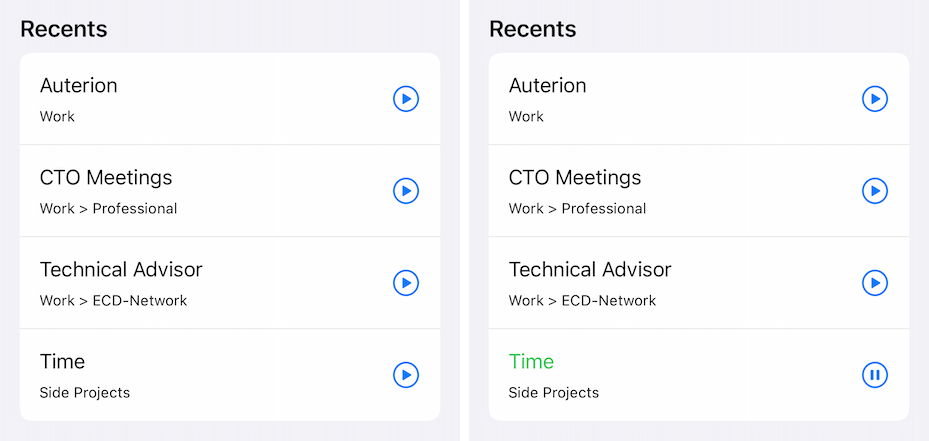
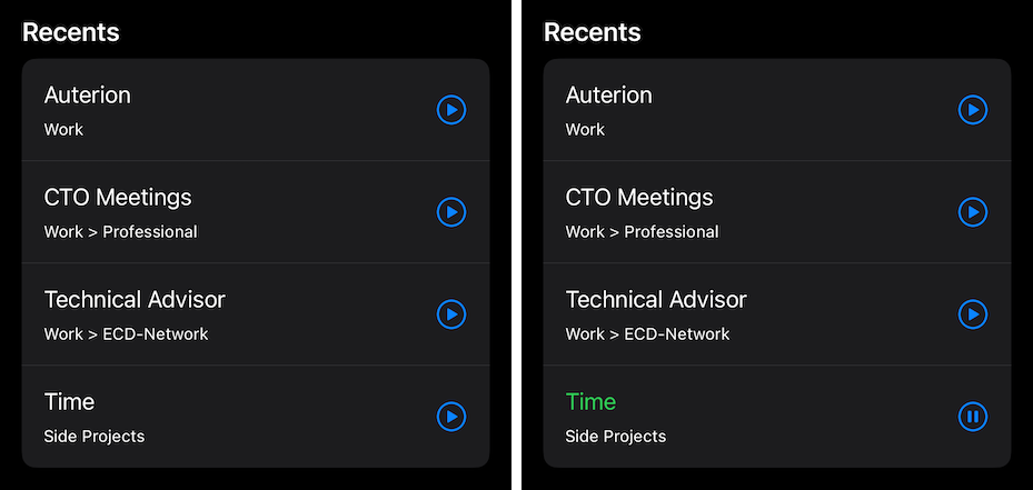
The design language continues for recent entries. From this list a timer for any category can be started and a running timer can be stopped. Running timers jump out because green means go.
All in these two major components give a complete view of the current status, actions on open timers and information about running totals.
With the assumption that most timers are consistent, ie: people work on the same projects within a given window of time, these two blocks alone mean that most of the daily usage can be driven from the home page without any additional interactions.
The current status is visible with zero clicks, and actions on the most used timers are a single click. This is a drastic reduction from the average of three clicks before.
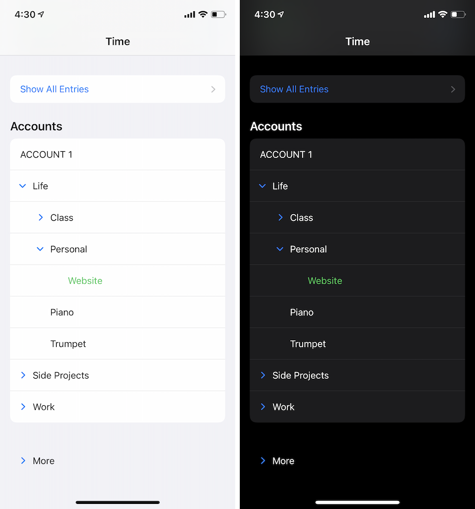
Below Metrics and Recents you can find the complete category tree. This interface is optimized for starting/stopping timers with the assumption that recording data will occur more often than organizing data.
Category children can be shown or hidden rapidly, and timers can be started on less seldomly used categories by swiping and clicking “start.”
The “Show All Entries” button like Apple’s “Show All Health Data” pushes to a complete list of data and provides access to managing specific entries (and stopping running ones).
Together metrics, recents and the category list make it very clear what timer is running and the flat structure drastically reduces the navigation time within the app.
This is what the complete interface looks like when I launch the app:
Conclusion
In building my own time tracking platform I wanted to build something that was better and stronger from both the data and UI/UX perspective. This is a tool for my daily use, and I want to make sure that it meets all of my expectations.
When considering the following goals it is clear that this app is moving in the right direction. The major points I set out to resolve have all been solved.
- Clearly indicate if some timer was running without opening the app
- Solved: iOS 14 widget – exceeds expectations
- Clearly indicate which timer was running immediately after opening the app
- Solved: Top-level “first focus” data changes color
- Avoid notification badge noise
- Solved: See #1
- Reduce navigation time within the app
- Solved: Reduced navigation complexity, and made common daily actions zero or one taps
My biggest disappointment with the current design is how I’ve hidden some category and entry-specific settings under a swipe + modify button press, but this choice removed the need for an out of context edit button and the hidden actions should be low use.
Despite that, Time feels like a natural part of the system.
This post is the second in a series about my Time project.